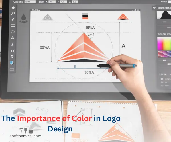
Choosing the right color for a logo is one of the most important decisions in brand design. Colors not only determine the appearance of the logo but also convey emotions, messages, and the identity of the brand to the audience. In today’s world, where competition between brands is increasingly intense, designing a strong and impactful logo can be considered one of the key factors for a brand’s success. A logo, as the face and visual identity of a brand, shapes the first interaction between the company and its audience. But what is the best color for a logo? The answer to this question depends on various factors, including the industry, target audience, brand message, and color psychology. In this article, we will explore this topic and how to choose the best color for a logo.
The Importance of Color in Logo Design and Its Role in Brand Success
Choosing the best color for a logo is not just an aesthetic issue; it is a strategic decision that can directly impact how the audience perceives the brand. Colors can build trust, evoke specific emotions, and even influence consumer purchasing decisions. Therefore, a deep understanding of color psychology and how to use colors in logo design is one of the most important skills for brand designers and marketers.
However, the main question remains: What is the best color for a logo? Is there a specific color that works for all brands? Or does the choice of color depend on various factors? Answering these questions requires a deeper analysis of the many factors involved in this process. The industry, target audience, societal culture, brand message, and even competitors all play a role in the final choice of logo color.
For example, a brand related to food products might look for colors that stimulate appetite, while a tech company might seek colors that convey trust and innovation. On the other hand, using inappropriate colors can create negative emotions or even drive audiences away from the brand. Therefore, choosing a logo color is not just an artistic decision but also a commercial and psychological one that must be made with care and analysis.
The Impact of Colors on Emotions and Decision-Making
Colors play a crucial role in shaping emotions and reactions in the audience. This concept is known as color psychology. Each color is associated with specific meanings and can have a direct impact on how the audience perceives the logo and brand. Below, we examine the effects of different colors:
Red: Symbolizes energy, excitement, power, and passion. This color is highly suitable for brands that want to grab attention (e.g., food, fashion, or sports industries).
Blue: Represents trust, professionalism, and calmness. It is commonly used by financial companies, tech firms, and customer service providers.
Green: The color of nature, health, and sustainability. It is ideal for brands related to environmental issues, health, and agriculture.
Yellow: Symbolizes happiness, creativity, and positive energy. This color is suitable for attracting attention and creating feelings of joy and pleasure in the audience.
Pink: Represents love, femininity, and innovation. It is often used by brands related to fashion, cosmetics, and beauty.
Black: Symbolizes luxury, power, and simplicity. This color is ideal for brands that want to convey a sense of superiority and elegance.
White: Represents cleanliness, simplicity, and perfection. It is often used alongside other colors to create balance.
Factors Influencing the Choice of the Best Color for a Logo
To choose the best color for a logo, you should consider the following factors:
A) Industry and Type of Activity
Each industry typically prefers specific colors. For example:
– Technology industries use blue and gray colors.
– Food industries use red and yellow to stimulate the appetite.
– Brands related to the environment use green and brown colors.
B) Target Audience
Your target audience plays a significant role in choosing the logo color. For example:
– If your target audience is young people, vibrant and bold colors like red, yellow, or orange are more suitable.
– If your target audience consists of professionals and managers, colors like blue, black, or gray can convey trust and professionalism.
C) Brand Message
The logo color should align with the brand’s message and values. For example:
– If your brand message is sustainability and social responsibility, green is a suitable choice.
– If your message is luxury and superiority, black or gold can be effective.
D) Competition and Differentiation
Your logo should stand out from competitors. Studying competitors’ logos and choosing a less-used color can help differentiate your logo.
Combining Colors in a Logo
Using a combination of multiple colors in a logo can create greater visual appeal, but it’s important to ensure that the color combinations are harmonious and balanced. Some popular color combinations include:
– Red and White: Energy and cleanliness.
– Blue and White: Trust and professionalism.
– Green and Brown: Nature and sustainability.
Practical Tips for Choosing the Best Color for a Logo
– Simplicity:
Choosing one or two primary colors for the logo can make it more memorable. Colors should remain recognizable in different formats (black and white, color, and small sizes).
– Avoid Using Too Many Colors:
It’s best to stick to 2-3 primary colors.
– Usability in Different Contexts:
Colors should be visible in various sizes and on different backgrounds.
– Alignment with Brand Identity:
The logo color should align with the brand name, slogan, and other visual identity elements. Decide what feeling or message you want to convey.
– Know Your Target Audience:
Determine which colors resonate most with the tastes and expectations of your target group. Vibrant and energetic colors work well for younger audiences, while muted and formal colors suit professionals.
– Test the Colors:
Before finalizing the logo, test it in various formats (e.g., website, business cards, packaging).
– Study Competitors’ Colors:
Check the colors used by competitors and aim to maintain differentiation while staying relevant to the industry (e.g., blue is common and trusted in the financial sector).
– Experiment and Gather Feedback:
Create multiple designs with different colors and gather feedback from your audience or team. Evaluate the emotional impact and reactions of individuals.
– Ensure Flexibility Across Media:
Make sure the chosen color performs well and looks good across different media (web, print, social media).
Successful Examples of Logo Color Choices
In logo design, choosing the right colors plays a crucial role in brand impact and recognition. Some successful examples include:
- Kellogg’s: Red and yellow colors convey energy and liveliness.
- Coca-Cola: The red color in Coca-Cola’s logo symbolizes excitement, energy, and happiness.
- Apple: A white background with a simple and appealing logo conveys simplicity and innovation.
- Google: Diverse and vibrant colors represent variety and creativity.
- Firefox: Orange colors evoke fire and energy.
- Nike: Black and white colors symbolize power and trust.
- Amazon: Yellow alongside the logo conveys optimism and satisfaction.
- Starbucks: Green in the Starbucks logo represents nature, calmness, and sustainability.
- Facebook: Blue in the Facebook logo represents trust and connection.
Conclusion
Choosing the best color for a logo is a strategic process that requires research and analysis. Colors not only define the appearance of the logo but also convey emotions, values, and brand messages to the audience. By considering factors such as the industry, target audience, brand message, and color psychology, you can design a logo that is both attractive and effective.


26 Responses
💚💚💚💚💚
Good job
The logo color have to align with the brand’s values and message
I love colorefull logo
A logo has to stand out competitors
Color plays a key and effective role in logo design and can significantly increase brand value.
Colors evoke emotions and psychological reactions. For example, red conveys energy and excitement, blue conveys trust and calm, green conveys nature and health.
Colors give a brand a personality. A luxury brand might use metallics or black and gold, while younger brands might prefer bright, energetic colors.
As a result, color in logo design is not only an aesthetic element, but also strategic and influential on brand recognition, trust, and overall success.
Choosing the right color, based on the culture, age, and needs of the target market, can ensure success.
Colors can convey a brand’s message and purpose more quickly and clearly, especially in spaces full of competition and advertising.
Attracting attention and recall: Attractive and appropriate colors make the logo memorable in the audience’s mind and help the brand be seen in a competitive market.
Each color conveys a specific feeling and message, for example, blue for trust, green for nature, red for energy.
Colors are usually different in each industry; for example, brown for a coffee shop, and gold for luxury.
Understanding the audience’s preferences, age, gender, and culture helps in choosing the right color.
Check out the colors your competitors are using to differentiate yourself while still fitting into the industry.
Color should convey the desired feel of the brand and create the desired experience for the consumer.
🤗🤗🤗🤗🤗
😍😍😍😍😍
There’s no single “best” color for a logo — it really depends on your brand’s message, target audience, and industry.
Blue: Trust, professionalism, calmness (used by tech & finance companies)
Red: Energy, passion, urgency (popular with food & retail)
Green: Growth, health, eco-friendliness (natural & organic brands)
Yellow: Optimism, friendliness, attention-grabbing (consumer products)
Purple: Creativity, luxury, wisdom (beauty & wellness)
🙏🙏🙏🙏🙏